Grid Lines in Magazines, Websites and so on are used to keep order and flow and manage text effectively, a poor grid system or no grid system at all can affect your work immensely.
For example, The Guardian:
The Guardian’s grid layout is very slimline and simple, It keeps all text separate so you don’t get lost and know what you’re reading about. The layout is very neat and is appealing to the eye.
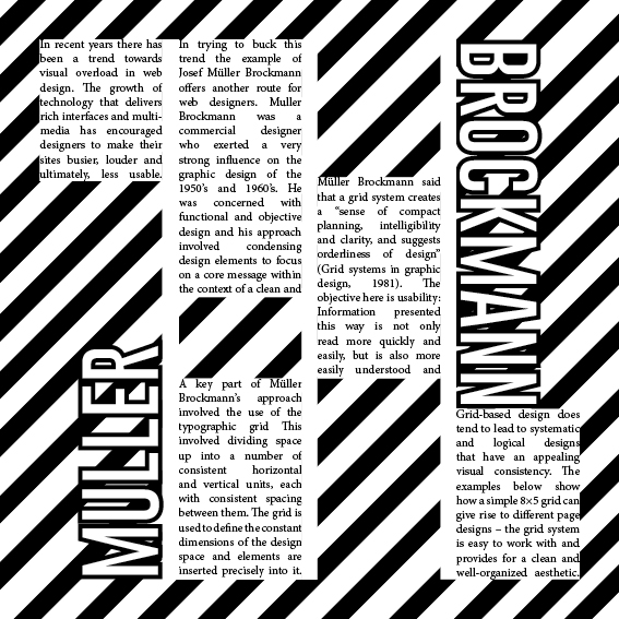
Muller Brockmann Inspired Desgin in InDesign:

I was given text from Muller Brockmann and was tasked to create an article with that text in the style of Muller Brockmann’s work. I decided to create the lines in the background as an artistic choice and I felt it was similar to his style. Grid Lines help a lot in creating work quickly and symmetrical. Grid lines are like lined paper, they keep everything proportionate and structured.
Comparing different Graphic Designers:
Josef Müller-Brockmann was the most well known Swiss designer and his work is likely to be the most recognisable. Brockmann was born and raised in Switzerland and at the age of 43 he was a teacher at the arts and crafts school of Zurich. During his life he published several books which provided an in-depth analysis on his own work, his philosophies and they also provided a great foundation for upcoming young graphic designers who wanted to learn more about the profession. In the 1990’s he toured around the US and Canada speaking about his work when sadly in 1996 Josef Müller-Brockmann died in his home city of Zurich.
Here are examples of his work:


David Carson was born in Corpus Christi, Texas on the 8th of September in 1955. For most of his early life Carson spent his time in southern California where he was a high school teacher before becoming the designer he is now. Carson also did surfing in his past time and was so ingrained with the sub-culture of surfing in southern California that he started to experiment with it in his graphic design work during the mid 1980s. However, he was not only a graphic designer but in 1989 he placed 9th as the best surfer in the world. RayGun is seen as what got him the most recognition and this magazine game him the chance to share is style which was characterised as “dirty” to the world.
Here are some examples of David Carson’s work:


Dissecting two of David Carson’s pieces of work:

With this image I like the use of the black and white graphics and font as I feel it is different to your average high saturated magazine cover and it also has a film grain look to it with some artificial age scratches which gives a completely different feel to the piece as most magazine covers and clean, follows some sort of grid line and is also sharp and has a lot of detail in the portrait of some sort of celebrity or whatever the magazine is promoting. The text in the background is great as at first glance it just looks like a bunch of mumbo jumbo however, when you look closely and read the text it shows names of poeple such as ‘Trent Reznor’, ‘Ben Stiller’ and ‘Beastie Boys’ to name a few and this is a great technique as it makes the audience look into your work more and more attached which increases the chances of them purchasing your product.

The typography used in this piece is big and bold however is hard to make out in places and I believe that David Carson used this because the lead singer of Blur is on the cover, and like the title of his band suggests, everything is a blur. With the use of colour, Damon Albarn (the singer of Blur) is the only thing in colour where everything else is in black and white. David Carson did this to create contrast and to bring more attention to Damon’s face to draw fans in.
Muller Brockmann 2 designs dissect
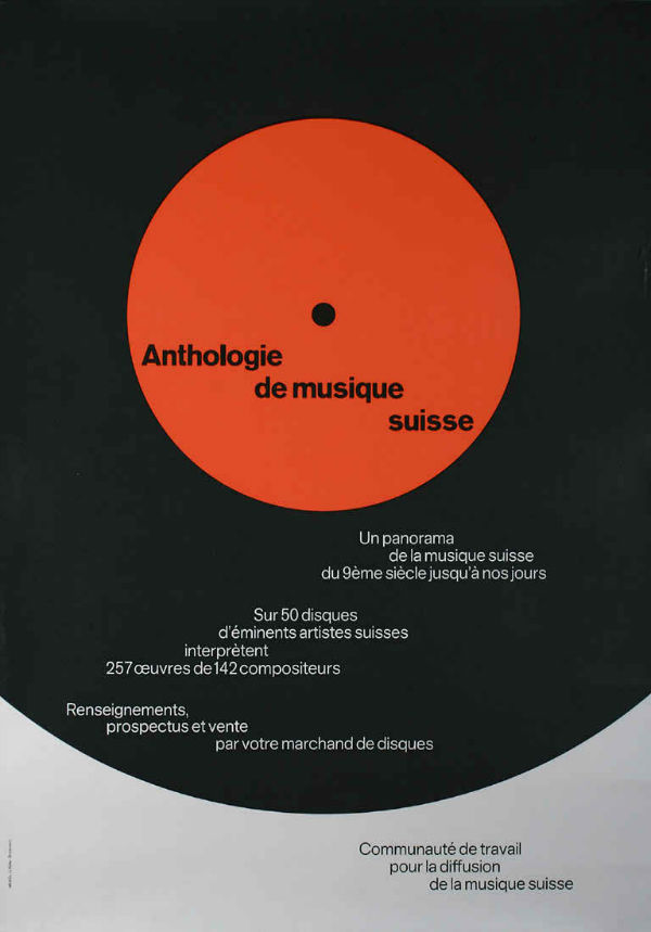
This piece is very symmetrical as Brockmann is well known for his grid line work which I have previously done work on before, so I am already familiar with his work. I really like how its simple yet eye catching as its clearly a part of a vinyl record. I also like the way the writing is written out diagonally down the vinyl itself I feel like that’s very creative. However I am not too fond on the bland colour scheme I think that it could do with a bit more of a pop of colour rather than the black, grey and orange.
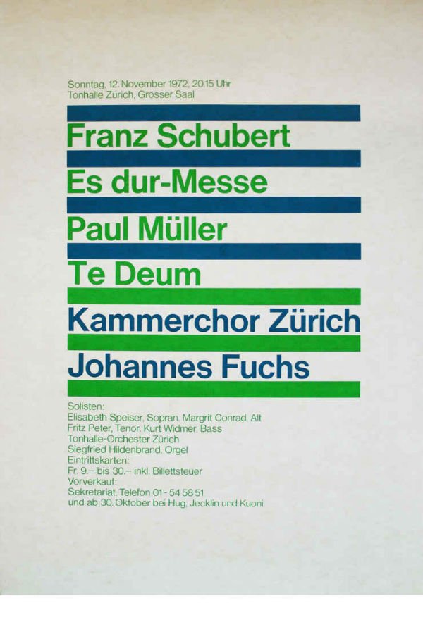
I really like the design and also the style of this particular piece as again he has followed a grid layout design for his work. I also much prefer the colour scheme for this piece of work compared to the other one as its more intriguing and eye catching than the previous one being more bland.
When it comes to David Carson and Muller Brockmann they both have very different styles. David Carson’s work is vibrant whilst also using black and white, distorted typography, does not follow a standard grid line and uses a lot of imagery in his work. Muller Brockmann on the other hand, his work is de saturated, does not use bold colours, follows a very symmetrical grid line and everything can be read clearly. However, Carson and Brockmann are similar in the way that they don’t follow the standard and norm of graphic design and make works of art than just pieces of information.
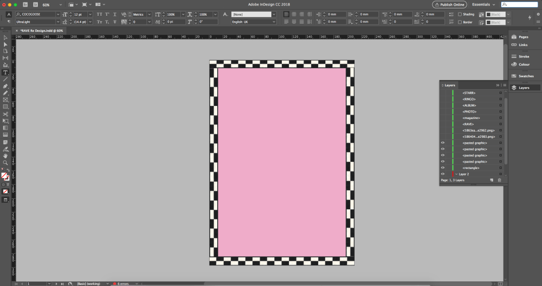
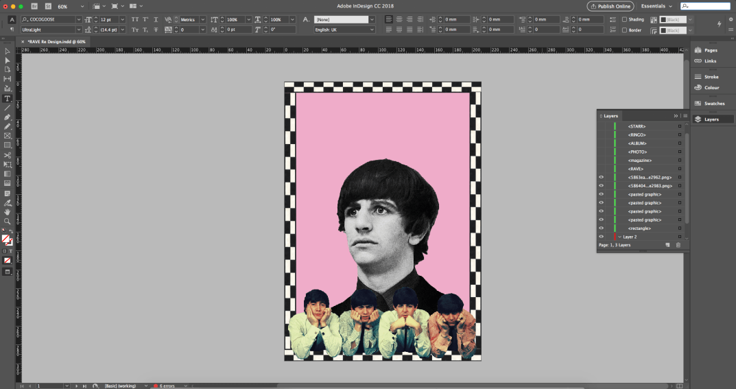
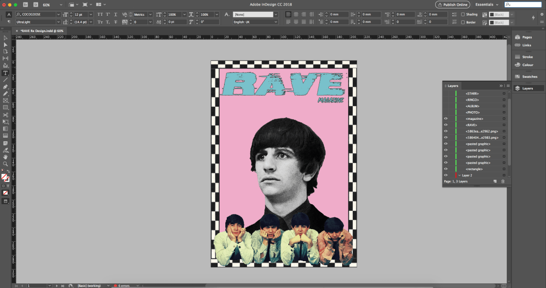
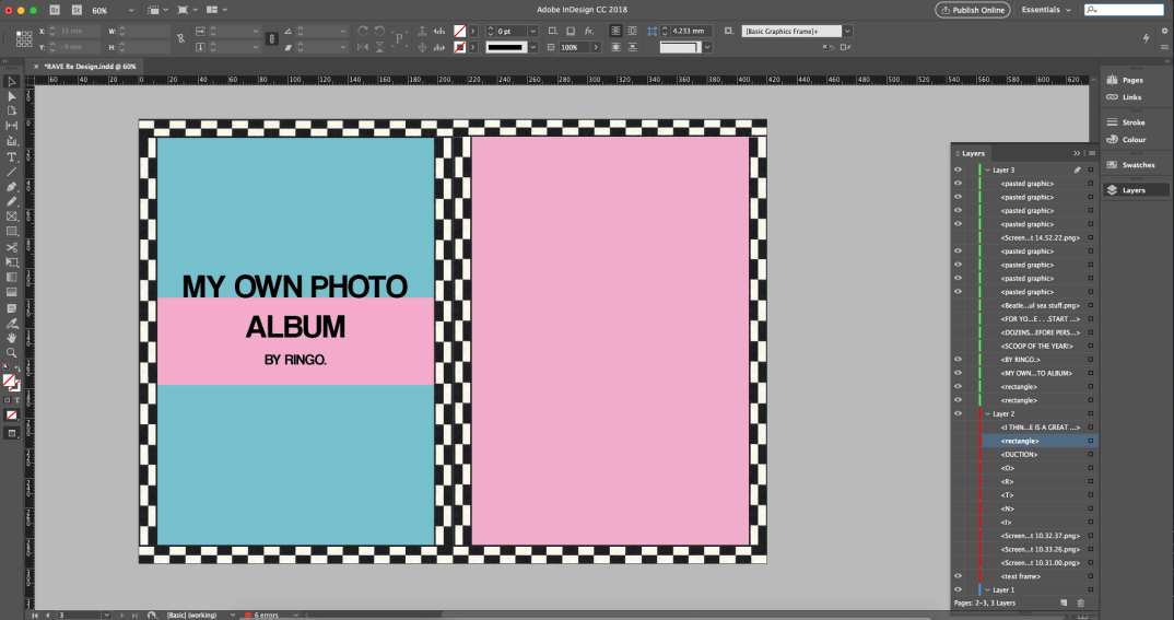
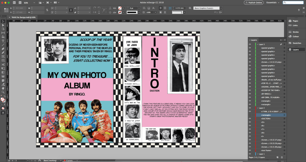
Reimagined Magazine Cover and 2 page spreadsheet:
I have been tasked with creating a reimagined cover and 2 page spreadsheet of a pre existing magazine. I quickly searched the web and in search of a vintage clothing or vintage in general magazine from the 90s as it is a style I am connected to as I love the fashion, I was born in the 90s and know that I can make something that follows that aesthetic whilst putting a more modern twist on it.
While I was searching for magazine that are primarily about male fashion in the 90s or something with a similar aesthetic whether that be with the music, selling vintage products, gaming etc. I stumbled upon a couple magazine covers from a magazine called RAVE.


When I saw the magazine covers I was immediately drawn to them. I love the use of colours and the high saturation, I also like the of the large circles in the first two and all round look and feel of them, however they do have problems.
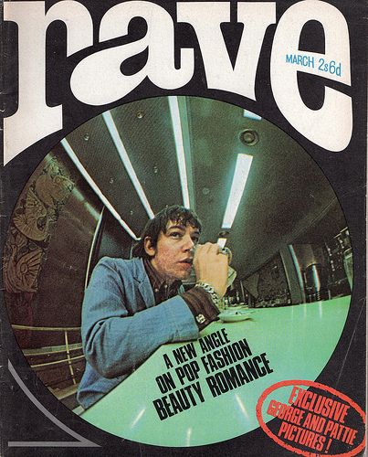
When it comes to this magazine I think everything is great. With the affect of the fish lens and the circular outline shape make it look 3D and pops to the audience, the text inside the circle follows the path of the table and the header follows the shape of the circle. The text and image are not central and are more over to the left however it does not affect the overall look and appeal of the cover.
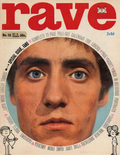
With this cover, again I like the use of the circular imagery as I find it very appealing and vibrant colours and saturation are appealing to the eyes also. The use of text wrapping around the circle is a good as it makes the audience follow the text and draws them in for longer. However the header does not revolve around the circle like the other cover which kind of just leaves it sitting there and the illustration at the bottom are just there and feel really out of place compared to the rest, which begs the question of why are they there in the first place.
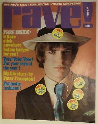
Now this cover is the worst of them all. The font has changed drastically which disconnects it from all the other magazines that have come before it, the colours do not sit well with each other, for example if the header was blue instead of the blue text then that would make it more appealing instantly as Blue compliments Orange and Purple compliments Yellow. Also the random badge pinned to the hat is and eye sore and should not be there, why is it on the hat and on such an angle? It does not look appealing and is a complete distraction.
While researching more into the RAVE magazines my girlfriend Hannah showed me another magazine called DAZED. I went to google and searched for some of their magazine covers, here are three covers that I found:
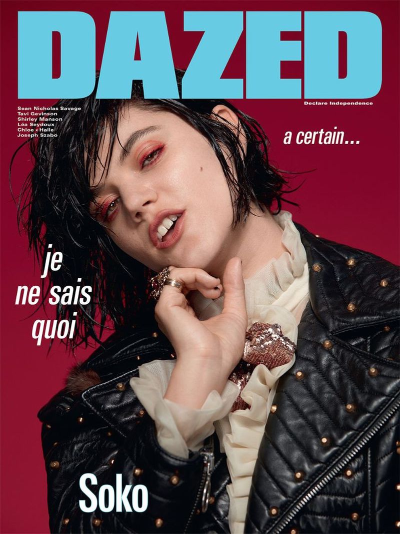
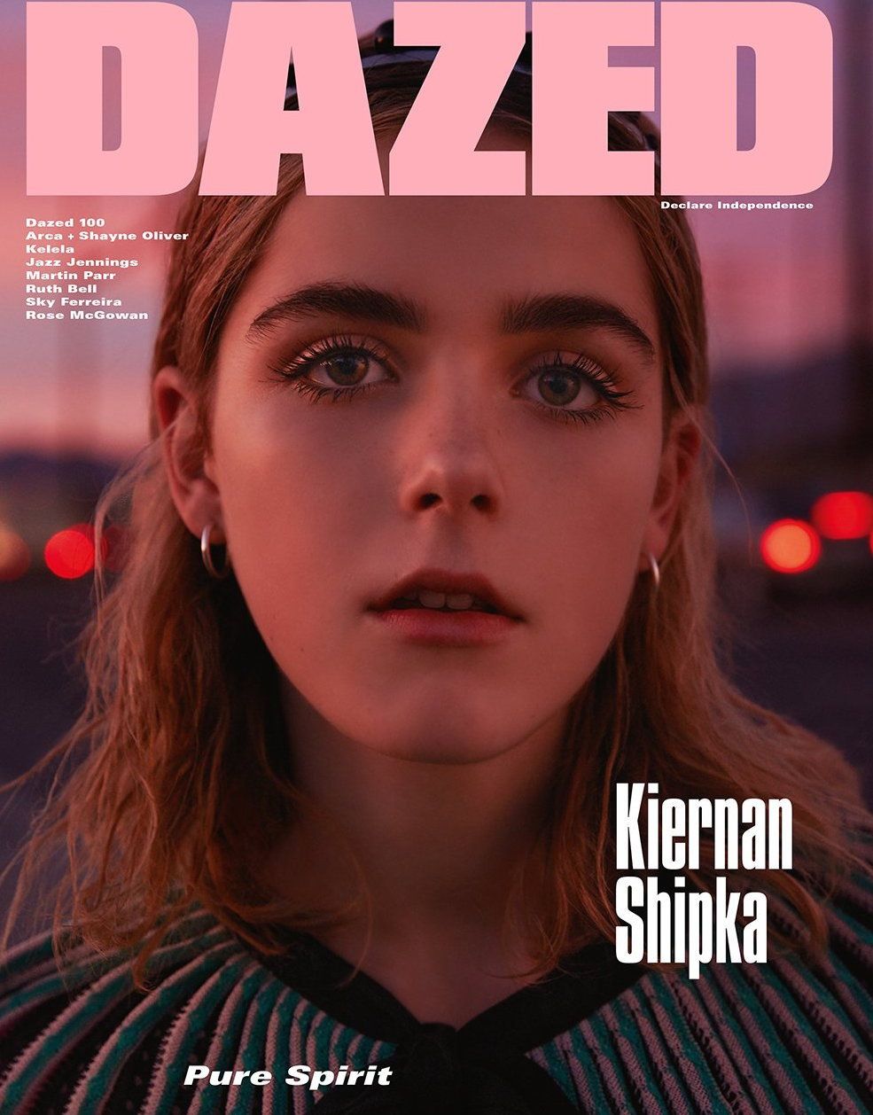

As you can see from these three covers they are very vibrant and appeal to the eye, all the colours work well with each other and all the text is proportioned well and follows a grid line. When it comes to my re imagination I will re design the RAVE magazine however I will use inspiration from the DAZED magazines and follow my own aesthetic which is a mix of 90’s grunge and ‘hippie’ vibrancy.
Before I begone creating the re design of the RAVE magazine I had to decide which colour palette I would like to use for my work. I used a website called Adobe Color (https://color.adobe.com/create/color-wheel/) where you can choose colours, see what colours work well with them, different shades etc and then you can take their HEX codes and place them straight into InDesign, Illustrator or any other Adobe software. After playing around with the different colours I came up with this colour scheme:
After finding the right colours I had to then find the correct fonts for the magazine that would fit the style of the magazine. I decided to use a website called DaFont which is full of fonts different fonts with different styles, genres etc. (https://www.dafont.com/) I looked through the website and found these font that I decided to use in the piece:


I decided to use these fonts as some are the same style as grunge aesthetic and others are minimalistic which is what look I want to achieve when it comes to creating this cover and 2 page spread.